Google is making it easier to install and update Android apps through the Play Store.
A minor but important upgrade to the Google Play Store could alter how consumers install apps. Users may find it simpler to install apps even after scrolling down to read more about them if the “Install” button is permanently placed at the top of app listings.
According to a source, Google is developing a new layout for the Play Store that may make it simpler for customers to install certain apps on their smartphones. To install an app on the Play Store, users now have to navigate back to the top of the listing. The business might, however, redesign the headers for app listings to keep the install button accessible while reading apps with lengthy descriptions, according to code discovered on a recent version of the Google Play store.
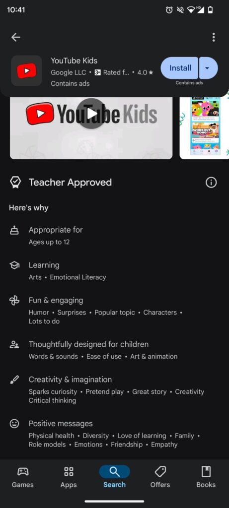
Google will prevent the header from vanishing as you scroll down an app’s description, according to code discovered by Android Authority on the Play Store v43.1.19. This is how the Google Play store now operates. This means that while you examine the description, the name of the program and the Install button will stay at the top of the screen.
Although the feature is still under construction, the newspaper claims to have tested its operation by activating it. When enabled, the new header displays the app’s name in the upper left corner of the screen, and the Install button and drop-down option to install the same app on additional compatible devices appear on the right.
Developers that write in-depth descriptions for their apps may find this new header useful, as scrolling through these presently obscures the download button. The install button and header are constantly visible, which might be useful for both developers and users.
According to the source, for apps that users have previously installed, the Install button will be replaced with an Update button. This would enable users to rapidly access the button after reading the changelog for an app that has an upcoming update.


These modifications are currently under development and have not yet been made available to beta testers, as is the case with any unreleased software. Before making the functionality available to testers, Google may choose to release it or make more design adjustments.
This modification, which was discovered concealed in the code of a recent APK deconstruction of the most recent Google Play Store app, aims to enhance the user experience by making app discovery and installation more straightforward. Although it is not currently available on the Google Play Store, it is anticipated that all users will be able to access it soon, but this is not a given. Although forthcoming features may frequently be discovered through APK teardowns, it is always conceivable that what is discovered won’t be released to the public.
To provide consumers with as much information as possible before installing an app, app developers are urged to produce comprehensive and informative app listings. But doing so may cause the Install button to move farther down the page, making it more difficult for consumers to locate. Developers gain from the new fixed Install button as it is visible at all times and makes it simpler for customers to install their apps after reviewing the information.
Other important app information, such as the program’s name and icon, developer name, average Play Store rating, and ad presence, will be included in the fixed header. To install the app on additional devices, a dropdown selection will also be available.
This modification is predicated on the idea that if an app’s Install button is prominently displayed, users are more inclined to install it. A lengthy app store listing may be instructive, but if the Install button is hidden, it may also act as a deterrent to conversion. Google wants to make it simpler for consumers to install apps and enhance the user experience by making the Install button more visible.
The revised Google Play Store banner will probably include several more modifications in addition to the repaired Install button. For instance, the average rating of the app and whether or not it has advertisements will now be displayed in the header. Previously accessible on the app listing page, this information will now be shown in the header with more prominence.
Discover more from TechBooky
Subscribe to get the latest posts sent to your email.


