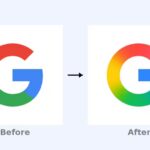
Throughout 2018, Google went on a bit of a redesign spree. It rolled out facelifts for a wide variety of its properties, ranging from Google Chrome, to Gmail, to Hangouts, and even Google News — in other words, just about every major service under the Google umbrella got at least a few visual tweaks—It seems Google is going to continue that trend in 2019, according to a blog post published today. In the post, Google Search’s Senior Interaction Designer Jamie Leach unveiled a slightly-tweaked look for Search on mobile devices.
According to the Mountain View, California-based company, with the new design, the name of the website and icon will appear at the top of a results card, followed by page title and the description of the page. Earlier, the page title would appear at top, followed by the URL or website name, and the page description. Additionally, the advertisements will now be accompanied a bold ad label, instead of the previous green label. The ad label will show up in the place of the website icon (favicon) on advertisements.
Google explained that the updated design will give it an opportunity to add more useful action buttons to the search results. In a blog post which reads:
“As we continue to make new content formats and useful actions available—from buying movie tickets to playing podcasts—this new design allows us to add more action buttons and helpful previews to search results cards, all while giving you a better sense of the web page’s content with clear attribution back to the source,”
“Our goal with Search always has been to help people quickly and easily find the information that they’re looking for,” and “Over the years, the amount and format of information available on the web has changed drastically … As we continue our ongoing efforts to improve Search and provide a modern and helpful experience, today we’re [working on] a visual refresh to better guide you through the information available on the web.”
However, the change is minor, but not inconsequential. It simplifies picking out reputable sources from a crowd of links, it makes it clearer when links are ads, and it makes it easier to acknowledge and remember where the information you see is coming from. You’d be more likely to trust an answer about the distance to the sun from NASA than, say, theearthisflat.com. Apart from the new design, Google is working to bring several more changes to the mobile search over the coming months. The company had previewed some of these changes like AR search results and full coverage for news results in search.
This is an important reminder that generally speaking, Google doesn’t create or record information – it just aggregates it. but in the meantime, the new design is rolling out to mobile first “over the next few days.” Presumably, it’ll roll out to des
Discover more from TechBooky
Subscribe to get the latest posts sent to your email.


