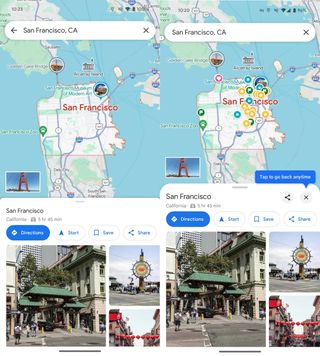
The initial indications of the Google Maps update, which appeared to prioritise showing more of the map at all times, were noticed by 9to5Google earlier this year. Strangely, a few weeks later, the partial rollout seemed to have been reversed, as if Google had finally concluded that the previous user interface was better.
However, it appears that the implementation has only been paused. 9to5Google explains how the new user interface has reappeared, although with some improvements, in a recent piece.
Similar to the previous version, the goal seems to be to do away with fullscreen overlays and provide users sheets that sit on top of the map, allowing you to see at least part of it.

The corners of overlay layers seem to be much more rounded, and they may now be removed with a single tap of the close button located next to the “share” icon in the upper right corner.
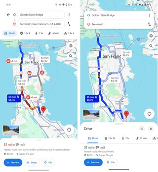
The most significant change occurs when you try to input directions, which is the primary reason users utilize the app. The comparison of screenshots below shows how it has been simplified: you enter your start and destination on a floating island, and the options for driving, taking public transportation, walking, ride-hailing, and cycling are moved to an island at the bottom.

All things considered, it seems like a minor improvement over the prior scrapped facelift. The contextual sheets’ lack of double backing is the most obvious change. It’s a little adjustment, but it does give the page a somewhat cleaner appearance and increases the amount of the map that is visible.
Discover more from TechBooky
Subscribe to get the latest posts sent to your email.


